Layouts
 |
 |
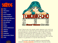
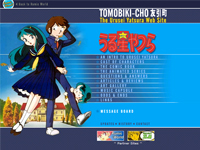
| Tomobiki-cho version 6 | Tomobiki-cho version 7 |
 |
|
| Mason's Rumic Page Index - Another side page to the old Tomobiki-cho. It was part of Mason's attempt at having a general Takahashi site, but it never followed through and was left as a sub-section of Tomobiki-cho. |
Mason's comment on the older desigsn:
Versions 1 through 4 of Tomobiki-cho were very short lived. Over the course of a few months in 1996, I was learning how to do web sites and in the process I remade the site several times before settling on the blue-orange-yellow scheme it had for years. I barely remember what 2 to 4 looked like since this was 11 years ago and each one only lasted a few weeks.
I recall one was dark blue, one black and one had yellow and black tiger stripes. Version #1 lasted the longest out of the four. That was called "Mason Ikkoku's Urusei Yatsura Web Page" It was mostly a long page of running text on a light-green background pattern made up of photoshop embossed UY logos. There were several 2nd level pages, mostly under construction. The characters section was the very first thing I worked on, since I was unimpressed by the shallow descriptions that existed on the only other UY web page out there.
Once I had finally created some decent content, I finally made a proper web site with version 5. Version 5 was very similar to 6, but more stripped down. The graphics were less polished, and the site was a little disorganised. The most obvious difference would have been that the color scheme was blue-orange-white, not blue-orange-yellow.
Version 6 involved me restructuring the site, rewriting most of the info, adding a wealth of new content and pictures, making the graphics look slicker (differnt fonts and flourishes) and adding a yellow background. I'm not sure exactly when this change was made. I believe it was some time around 1998. That design remained until 2002.